Why Colour and painting 15 minute thumbnails for Wall Murals work in more ways than one.
How I choose or add colors to my palette is by painting little 15 minute paintings of different segments of a large wall mural.
This is only one way to design a wall mural of course but it can be profitable. Reason is the smaller paintings become valuable once the details are finished and then can be sold for a nominal fee if the artist chooses to.
I should explain to readers who are here for the first time that yes I am a bit different and some would even say a bit over the edge but what can I say, I am always thinking outside the box, weather it’s painting wall murals, or studying why color reacts the way it does even in faux finishing. I have always been one to question authority and not to follow certain rules because of being told it’s the final answer. To me there is always a next question and nothing is ever final… even in death. (well I hope not anyway).
With that out of the way let’s move on…
The clients for this wall mural are of ones that every artist loves painting for.
Their story although not told to me in whole, could only be assumed, based on the elements of this wall mural that I was commissioned to paint for them. A very inspirational painting for which I can really wrap my soul around and actually become a part of. To have this kind of connection is rare for me and I truly believe I was chosen to paint this wall mural for reasons that even I do not understand. All I know is it was meant to be, and I must follow what ever it is that has pulled me here. Only an artist could understand what it is I am feeling about this painting and others would just think I’m off my rocker or out in left field somewhere having fallen into Lewis Carroll’s rabbit hole once again. Yes I have been there a time or two in my 50 plus years of life and have even painted a few wall murals there, if you know what I mean, but that’s another story.
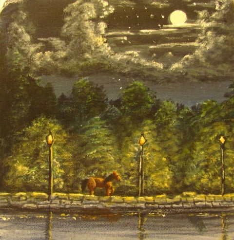
This wall mural is not a huge painting at 8ft x 8ft but it is large enough to really get wrapped up in. I’ll set the scene in which I have already stretched and primed the canvas and done most of the layout. The overall painting takes place in an early European time, set in the 16th-17th century when swashbucklers, chivalry where kings and queens where the law of the land. The wall mural is set with water front shops that are glowing from kerosene street lamps that reflect on the midnight water. The moonlight casts its light on the bridges that cross over to a community that appears to be doing rather well despite the hardships of other European towns of that era.
At this point I am going to begin a series of 15 minute paintings to pull my colors together for the wall mural and tell the story as I go because if I tell you the whole story now it will spoil the reason why I am painting this wall mural and the reason why I am approaching this piece the way that I am.
Why colour is important to this wall mural and is such a challenge is because there are actually two palettes that I am using. One being a cooler night time palette and the other of course being a warmer daytime palette.
The nighttime palette was a bit of a challenge for me to put together because it isn’t often that I do many of these type of wall murals or landscape paintings so with the help of renowned landscape artist Warren Peterson who has given me some insight on a nighttime sky I was able to pull the basics of why colors he suggested to use work very well together.
As I have always mixed my own blacks and grays landscape artist Warren Peterson suggested Paynes Gray as an addition to the palette. Although reluctant to do so I started painting the 15 minute thumbnails for the wall mural beginning with the sky.

I was truly ecstatic with the Paynes gray and really was amazed at how clean the color looked in the paintings when used correctly with Cobalt blue. It does make a great nighttime sky but I did add a touch of Cerulean blue (hue) to warm and kick up some intensity.

By adding yet another color to the nighttime palette of Unbleached titanium white which warms and pushes back the intensity of the Titanium white in the paintings. Although the painting is rough this is not the purpose of this thumbnail. What were looking for is color value and temperature. Just from what I see at this point I know I need another warm color.

Working with small paintings helps to understand why color works the way that it does. As I add in slightly warmer colors to what represents the treeline in the wall mural I immediately saw the next warmer color I needed to add to the nighttime sky and compliment the treeline. So now I have most of my colors chosen for the wall mural’s nighttime sky there is still one missing and for the next thumbnail I will be able to finalize my nighttime painting palette.

This is how I love to work out my designs and palette color additions to painting my wall murals. Painting whats called a maquette and getting to know why color works is important and makes these little 15 minute paintings valuable when studying color.
I saw by this thumbnail painting when using the warmer landscape colors which you do see at night that my next choice for the sky would surly be on the red or possibly orange side.
Although the 15 minute paintings are more of an impressionistic style than what the wall mural will be it still gives me the right direction very quickly. Although nothing really changes on my second palette when painting in the light I still have added a couple of colors from the nighttime palette to achieve color harmony.

9 thoughts on “Wall Murals and Painting Color”
What a great idea Art. Many times I use my iPad for the same purpose of thumbnails just to remember and idea, color and placement for my next project. The big drawback is color. Using art apps in the iPad are great but making small paintings is even better. It really gives you a chance to experiment with color. I just painted “Angel Hug” and needed a really intense blue. I was able to get it on my iPad but not in a painting. The colors were just not available. You are some amazing artist Art – are you tired of me saying that yet? Lol
Donna thanks for the compliment and I don’t ever get tired of it at all, In fact coming from you it is actually saying a lot about my work as I would encourage every one to go take a look at Donna’s art work as well. In fact I love how you are helping others with your virtual assistant site on Interior Design. The accuracy of how you are able to pull colors together for clients virtually is amazing and helps so many people that I recommend you to those who have an open mind to the idea of it. It really is unique and very helpful to even those who are the Do It Yourself kind of category.
As for painting thumbnails it does help in so many different ways which are to many to list in the comments section here but I am glad that my post gave you some insights to using the same concept, it really is a win win situation ….Peace!
Thanks Donna, I had a hard time trying to hit some colors as because the chroma and/or intensities of them were hard to come by. However I did discover a paint that is used for scenic painting that has been around for eons used in the theater and stage production side of the arts that I found very useful called Rosco Super Saturated you may look into. I really think your work is amazing as well and would love to do a show with you.
Your paintings and murals defy the imagination. You would do such honor to my sunset. I will have the measurement of my other one of abstract flowers, as soon as I get finished on my PC.
Thanks Terry, I been doing a lot of updating as there has been some strange things going on with the WordPress formats.As soon as you get what you need you may just contact me through my email or call. I am so ready to get on another canvas painting.
In my zest to critique the light, I did not mention the focus on darkness. I was not aware, until now, of the extraordinary nuances of black. As your thumbnails illustrate, the degree of dark is very subtle and has passed by me unnoticed until now.
Thanks Scott,
Yes I was a bit hesitant at first about this myself but found it to be true about the degree of darkness, time of year, positioning of the moon and the part of the world from which you are viewing from all play an important part. Atmospheric perspective at night is a totally different ball game and find it most challenging. I have already blocked in the sky based on the thumbnail and am thrilled with the results. Once I block in the clouds I will get a post out about it with a time lapsed video. The richness of it was my goal and I have accomplished this so far at this point….
As a commercial fisherman fishing at night, I gained a good deal of appreciation for the night sky. I can learn a lot about color from the demonstration here. But, a full moon (and light pollution from street lights) nearly always destroys viewing stars. I would recommend no stars close to other light sources so as not to offend the astronomers. Also, I recommend The Annotated Alice by Martin Gardner as a good deal of fun.
Hi Scott,
Once again I really enjoy your additions to my posts and wanted to thank you for your insight about the stars and light source. The stars at the lower part of the sky were actually a mistake where I over did it and wasn’t thinking. These little jewels that I paint is where I learn a lot of several things and I really enjoy the insights (or critique) from another view. I also think the stars are too large and on the last thumbnail the sky is too dark at the bottom but this is how I work these things before going to the mural.