In my opinion faux finishing and decorative arts are two separate categories or art forms.
Ornamental painting or The Art of Painted Decoration, an art form all its own, should fall under the category of Decorative Arts as a whole.
Let me explain,
The term faux finishing or faux painting was forced upon decorative artists during the housing boom because of the French word faux meaning fake or false, and personally I don’t care for the term or like being labeled as such but sometimes its just the way things come to be. So with that being said when I think of, or discuss faux painting ideas as a topic I think of it as a subject that covers everything in our industry as a whole. All the several techniques of the business are respectively all sub categories such as “marbling”, “graining”, “gilding”, etc.
Decorative Arts would be a category in itself to include The Art of Painted Decoration, ornamentation or ornamental painting.
However by rights they are all separate art forms. Yes I know it sounds confusing but for me I have to think of them this way to at least have some kind of order within my scrambled way of thinking. I know so many various techniques that I would probably go mad if I didn’t. But don’t worry I have no intention of cutting off my ear or anything like that as of yet.
I don’t know why but sometimes I feel that I have to explain my mindset in hopes that it brings you down to my level of thinking so we are on the same page before I explain how or what I was thinking when I come up with some of things that I do.
Trust me after a few of my posts some of my subscribers will hit the last link on my newsletter never to be seen again.
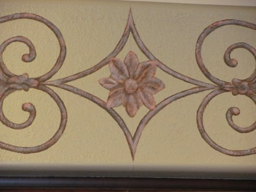
The ornamental painting idea I came up with for this rather small decorative arts project actually came about while working on the bamboo bas relief finish that I posted about a couple of weeks ago. The Interior Designer wanted to pick up the ornamental design from the kitchen table and use it as an accent above the cabinets but she also wanted to keep it simple, so I sharpened my pencil and grabbed my pad of graph paper.

Most would try and match a stencil design but I prefer to draw out my own ornamental painting idea for my decorative art and here is where I started with this particular design which was really quite simple but it goes back to the old adage of sometimes less is best

When laying out this kind of ornamental painting idea it is a pretty simple process of whats called mirroring the drawing. If you look closely at the photo you can see where I folded the graph paper and traced the drawing to create the lower half of the drawing. Being that if you have a dark enough line drawing of the top half of the decorative art piece you should be able to see it enough to transfer it from the back. What you end up with is a line drawing on both sides of the graph paper which means all you need to do to create the left side of the ornamental design is flip the right side over to create the left side. This eliminates the use of graphite or transfer paper thus saving you time and money, you just need to be sure that your bond and center lines are laid out correctly on the surface that you are transferring the ornamental painting design to is square and centered in accordance to your reference lines of your decorative art piece.

The maple leafs I added after creating a separate pattern of one and placed it after I transferred the initial ornamental painting design. The flower design for the center I will do the same way but only I will paint that in last as I want it to be a little lighter in value and a little more intense in color so the eye is pulled to it when viewing the overall ornamental painting.
I have already started the hand painting part by base painting the design in a darker value of a color that compliments the green/brown surface that I was painting on to create some color harmony within the ornamental painting ideas. I needed to match the colors in the furniture but I also had to make sure the colors worked with the tones of the mahogany colored cabinets which this decorative art was going above.

I darkened the value of the base color by using Faux Effects Faux Creme Colors Vandyke brown with a touch of Ultramarine to gray it out some. The decorative art painting was done on a textured surface known as a “knockdown texture” which actually helped when creating the distressed look like what is on the furniture piece so the paints I used where applied using an “open palette” with a dry brushing technique. Also just so you know the flower in the center was added after I completed the initial ornamental painting of the main frame work to keep the colors uniform.
The second color I used for this decorative art was almost a perfect match to one of the distressed colors in the chair which was Faux Effects Setcoat Terra Cotta but I did have to adjust it a bit to kill some of the intensity and then for the final color I used Faux Creme Color White and Vandyke brown. To create some dimension to the ornamental painting I just used a trompe loeil technique adding light and shadow by going back to the FCC Vandyke brown with a touch of Ultramarine and dry brushed shadows where they needed to go and the hi lights consisted of my “dirty white” mixed with a touch of my Terra Cotta mix

Adding the flower I wanted it to stand out just slightly more than the rest of the ornamental painting idea and by using the same colors I just added more intensity to it which from the correct viewing point it draws the viewers eye to the center of the Decorative Arts.

Hopefully I have brought some insight with this post about what is involved when it comes to the decorative arts and I hope you now can the difference when comparing it to basic faux finishing. As I said ornamental painting ideas comes from many different things and the work that is involved is much different than what most people would consider to be “sponge painting.”
However I do realize that my way of explaining some things does butcher the English language and confuses some people but I’m an artist and not an English major so if you have any questions about this post just leave a comment below.
5 thoughts on “Decorative Arts and Ornamental Painting Ideas”
Arthur,
It’s great to see how you work, it very similar to the way I worked way back when I had to work with a client,when I was still an illustrator. I love your blog and I am very inspired by your interview with Mari-Lyn Harris on her blog; about the way to approach blogging as an artist. You helped me with my web site a little and I am so grateful for your instructions on how to become more self-empowered with our artist marketing efforts. Your blog is fun and instructive I wish I lived in Florida so I could attend your classes.
Thanks for the kind words Kathleen, I do try to help when I can and wish it could have been a little longer and Mari-Lyn and I are discussing doing more of these. Basic SEO should become common knowledge for artists and small businesses in the future which will help them properly market themselves online. There are many aspects to SEO that really get involved which the average person doesn’t understand or really needs to know. By learning the basics this will open up the line of communication and make it easier for the experts to understand the clients needs thus keeping the costs and work load down for the experts. It’s very hard to understand a client if the client does not know how to communicate with the person applying an SEO strategy. Clients who know how to do the basic things such as optimizing pictures, videos, pages and posts are things they can do while writing their blogs. This not only saves you a ton of money but it allows the experts to maximize their time which means fast and more efficient results. A true Seo expert knows the business of SEO and not the business of the client, just as a website designer does not know SEO.
Art, this is fabulous! Thanks for sharing your work and ‘how to’! You have a very methodical way of both thinking and working. This was helpful information!
I think you are correct about the word ‘faux’. In a sense, all art could be described as such. I have a full size Polaroid photo of a Monet that is so real that people touch it to feel the texture from the palette knife. Is it a fake? Certainly. But also exquisite art, nonetheless.
Great decorating idea manifested, as usual, with masterful skill. Patroness could not have more pleased. But, how was the actual transfer of both ‘sides’ made from the paper to the wall?
Hi Scott welcome back my friend,
yes the word faux is one of those words I don’t use much when talking to clients of higher education because most likely they would know the origins of the word and the meaning. So what your really telling someone when you use the terms together like “faux painter” “faux artist” etc. is that you are a “fake painter or a fake artist” It’s kind of hard to convince someone that you are a professional when you refer to yourself this way. (marketing 101) Anyway, the transfer works because of the graphite from line drawing. Of course you know you need to find the center (level and plumb) of your design on the wall which would be the left edge of your drawing on the graph paper. After you find the center on the wall you line up the left edge of your design on the right side of the center line then flip your design over revealing the back which would now make the design your left side instead of your right. You should be able to see the drawing right through the graph paper, if its too light then go back and darken it more with a sharp HB pencil to darken the line drawing by retracing it until you can see it from the back side. Note: You can use a “lightbox” and lay the drawing on that and simply trace the line on the back so you can see it easier but then your just adding another step to the drawing but that’s ok what ever works for you. Doing this gives you a drawing on both sides of the graph paper that are exact matches and are “mirrored” images. Don’t forget though you must trace your reference lines on the back as well and use the same measurements for your layout on the wall. Once you transfer the left side to the wall flip the graph paper over and line it up to make the right side and you will have a perfect mirrored image of the left, its quick and easy thus saving time. Using this technique is how single overlay stencil designs are made which are typically done in “quarters” (1/4) top, bottom, left and right to get that “perfect pattern” look.This is all part of basic perspective which every artist should know and study just as an artist should study color theory and atmospheric perspective which is the filtering of color, light, and shadow.